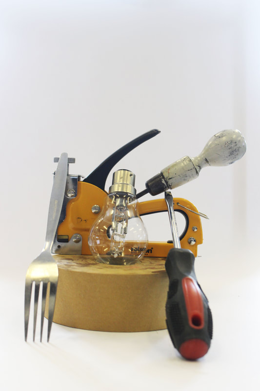
David Hockney photo joiners, First Responce
|
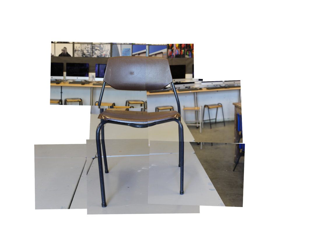
Today we looker at David Hockney and his photo joiners. We photographed a chair and used photoshop to position the several images so that many photos are made to look like one.
First you take photos of your objects from different perspectives, then put them into photoshop. In photoshop you File > Automate > Photomontage. Make sure to turn of blend photos. Then move around your layer and put into the right position.
I think mine has turned out well and you can tell that it is one object, a chair. However next time i would like to practice making a photo joiner by using pictures of a person, a more complicated object or even a still life scene.
David Hockney
|
David Hockney is an English painter, draftsman, printmaker, stage designer, and photographer. He was an important contributor to the pop art movement of the 1960s. Portrait of an Artist became not only the most expensive work by Hockney at auction when it sold at Christie's in New York on 15 November 2018 for £70.1 million. He was born on the 9 July 1937 in Bradford, making him 84 years old. I like David Hockney's work because it is abstract and creative, i think lots of people can be able to do it as well using different medias, for example online in photoshop or on paper using printed out photographs. |
  |
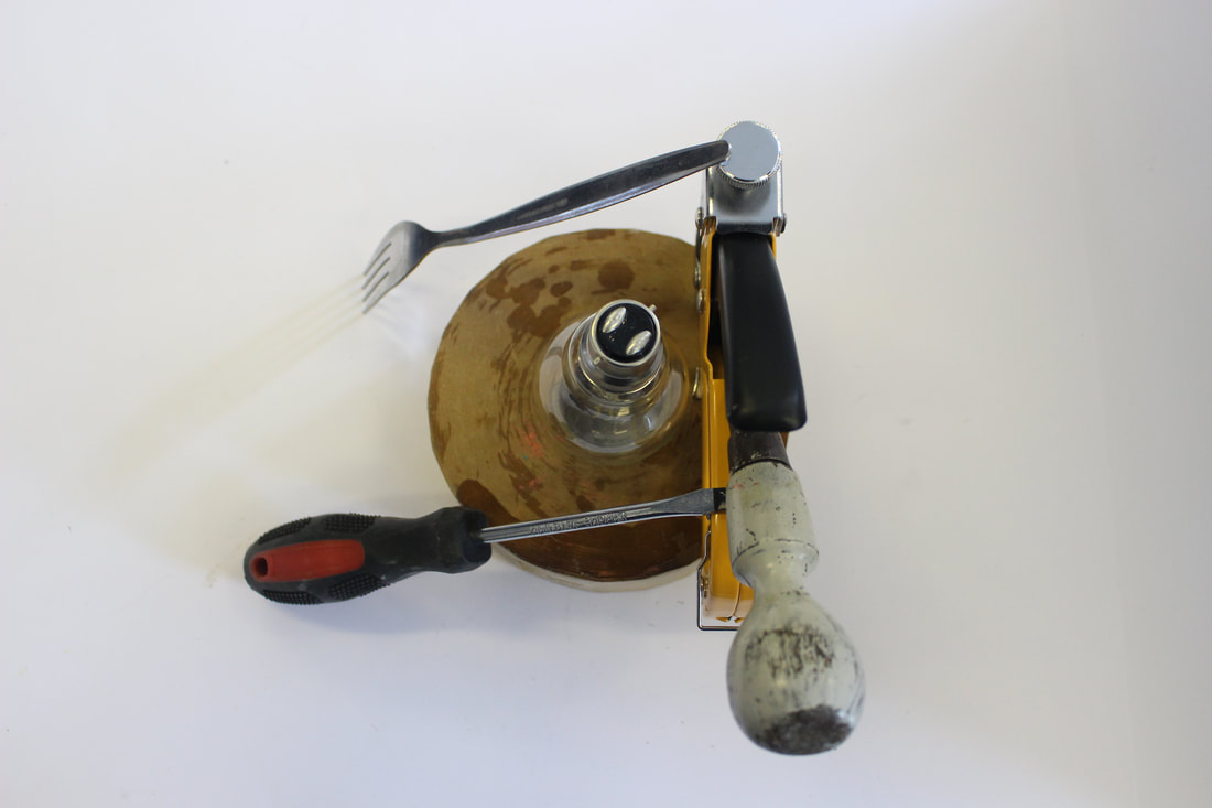
David Hockney photo joiners, Second Response
Today we did the second response to the David Hockney photo joiners. It was quite hard however i think it went well, my WWW would be that you can tell the image that is i have attempted to create. However my EBI would be that the mosaic patterns on the fire place do not fit together and if i ever redo this price i would want to fix that.

|
|


David Hockney photo joiners, Third Response
This lesson we create another photo joiner but this time with a more complicated obese than because of all of the leaves. I think it turned out well and the pot the plant is in all fits together however the leafs a were slightly more complicated to execute. Next time when making a photo joiner with leaves I would use more pictures that are closer up.

|
|


David Hockney photo joiners, Home Response

|
For my home response I decided to use a guitar. These meant the images fit well together and after practice at school I didn't find them it too hard to complete.
My WWW would be that the image has worked well and that it is a representation of David Hockneys photo joiners. My EBI is that the background is not in focus because I had to re size it bigger that the photo I took, this is a small detail which could be improved, also the background doesn't line up. |
Simplified images
|
|
To make a simplified image you upload the image to photoshop then the next step is to click on the lasso tool in Photoshop and select the Polygonal Lasso Tool. Then highlight your chosen shape by clicking the tool around the shape and then return to the point that you started at. When you have done this the shape will show as being highlighted. When you have selected the shape Click on Filter > Blur > Average. Finally Work your way around the picture selecting all the different shapes.
|


|
I think this lesson has gone well, the gif works well and the colours match, i also like the gif i created using my simplified image. Most of the picture is coloured and it does look like the building only simplified. Next time i don't want to miss out a part like i did on this picture and also I want to do a more complicate image that isn't a building like a landscape like mountains.
|
Paul Eis - mixed architecture
I think this lesson went well i understood and executed the lesson well, i used a range of colours and created cool backgrounds, however next time i think they could be edited neater and maybe try an ombre colour pattern. This assignment I found hard, one reason of this may have been because I struggle with photoshop, I would like to work on this weakness.
|
|
He was born 1998 in Berlin. After finishing school in 2016 he moved to Austria to study architecture at the University of Arts and Industrial Design Linz.
He was interested in architecture since my childhood. he always had a fascination for towers, bridges and other spectacular buildings. Later, when he discovered photography, he got more into architecture and the built environment around him.   |


Andre Kertész
|
André Kertész, born Andor Kertész was a Hungarian-born photographer known for his groundbreaking contributions to photographic composition and the photo essay.
Kertész never felt that he had gained the worldwide recognition he deserved. Today he is considered one of the seminal figures of photojournalism. Hungarian-born American photographer known for his lyrical and formally rigorous pictures of everyday life. I will be basing our next project off of his work, called form over function. |
    |
Form over Function - First Responce
|
This lesson was the first lesson trying to recreate the Andre Kertész fork pictures. I think mine went well and the you can see shadows being different things, form over function. However next time i would take photos from different angles. For example not just above, lower down and from a birds eye view as well. Also make sure my photos are in focus.
Also i turned a photo into black and white: When tuning these photos into black and white I found that there was only a subtle difference in the picture as they were already colourless however I liked the cleaner look it gave it. |
|


Form over Function - Second Responce
|
|
The photos i took for my form over function second resoponce weren’t just forks, i brought in items from my home and used them as well to create interesting shadows which could be over things. For example you can see a whisk and sunglasses in my pictures.
My WWW would be that some showed interesting shadows and i am getting better at manipulating the torch/light to show it. However my EBI is that some photos are very blurry, same as my last response i need to improve them. And and could be taken better I also need to work on my close up shots. |
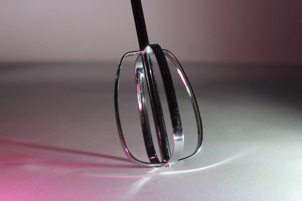
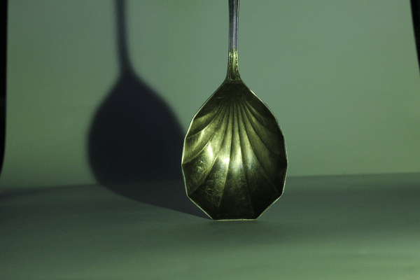
Form over Function - Third Response
Today we experimented again with using the form over function using shadows, however today we used coloured lights to reflected shadows and also made gifs using the photos we've taken. By only photographing one side of the cutlery or with a particular lighting, it fragments how they look.
WWW: I think that the colored lights played a significant role in stepping up my photos, the colors are reflected off the silverware and make the image very cool.
EBI: Next time i want to make sure only the white background is shown and make the photos or gif look more finished and professional.
WWW: I think that the colored lights played a significant role in stepping up my photos, the colors are reflected off the silverware and make the image very cool.
EBI: Next time i want to make sure only the white background is shown and make the photos or gif look more finished and professional.
|
|


Edward Weston
Edward Weston was a 20th-century American photographer. He has been called "one of the most innovative and influential American photographers" and "one of the masters of 20th century photography." In 1937 Weston was the first photographer to receive a Guggenheim Fellowship, and over the next two years he produced nearly 1,400 negatives using his 8 × 10 view camera. Some of his most famous photographs were taken of the trees and rocks at Point Lobos, California, near where he lived for many years.
Our next project Ordinary to Extraordinary will be based off of his work, I hope to achieve the same clean black and white look that Edward Weston was famous for but also still experiment with the colours on vegetables for example peppers.
Our next project Ordinary to Extraordinary will be based off of his work, I hope to achieve the same clean black and white look that Edward Weston was famous for but also still experiment with the colours on vegetables for example peppers.

|
|


Ordinary to extraordinary - response 1
|
|

These photos are the first response of my ordinary to extraordinary collection of photos. We learnt about the sun and light this lesson for example if you were to build a photography studio you should build it facing the north for sun slight all day. In our classroom we opened to blinds all the way and set up black backdrops. WWW: This lesson i got some good photos my favourites being the ones of the skull, and in black and white too. They all are in focus and have great lighting. EBI: However this lesson i think i could improve my photos by getting closer up especially photos of the cabbage leaf. |


Ordinary to extraordinary - response 2
Response 2 of ordinary to extraordinary meant taking the same photos as the previous lesson with the same props however this time in the dark and using torches to create abstract shadows. This would require different settings for our cameras for example an iso of 2600 and a shutter speed of 1/60.
WWW: Today i think i got some good photos in black and white creating an Edward Weston feel and i also worked on my EBI of last lesson, the close up images (like the cabbage leaf) these have come out well.
EBI: I need to take some whole object photos where you can see the whole object.
WWW: Today i think i got some good photos in black and white creating an Edward Weston feel and i also worked on my EBI of last lesson, the close up images (like the cabbage leaf) these have come out well.
EBI: I need to take some whole object photos where you can see the whole object.
|
|
|


Lockdown Sculptures - Response One
These photos are my response one for lockdown sculptures. This idea was create in lockdown 2020 for work do be done at home. My photos could be done at school. The WWW is that they are clear photos and have come out well after i edited them on photoshop. The EBI for these photos is that i want to try with more minimalist photos and also make sure i have a clear white border on all the sides of the photo.
|

|
Sharon Radisch
"Witty still lifes created by photographer Sharon Radisch during lockdown"


Lockdown Sculptures - Response 2
This lesson was the response 2 of our lockdown sculptures. I built some sculptures again and photographed them, i think that my WWW is that i edited them well in photoshop and i managed to capture the whole of the sculpture with white borders. My EBI is that i want to create more advanced sculptures to photograph.


Lockdown Sculptures and Simplified images
In this assignment we merged slimpliflied images and lockdown sculptures (our current topic). We put them into photoshop and edited them. This WWW is that i think its is need and you can see the original image in it, also you can see what each piece is like the fork. And the EBI is that i want to do two more, one with more contrasting colour and one with more similar colours like a different shades of blue.


Jan Groover - Homework Sink
For this homework we had to impersonate the work of Jan Groover. I used glasses, bowls, cups and a jug. For this my WWW would be that i managed to capture some reflection of light and i got some close ups. My EBI would be that i want to redo this idea when i have bowls and plates with colour or use some clouded light.


Chad Pitman
|
Chad Pitman is an American photographer discovered his interest in image making at an early age through his father's photography. He went on to study colour theory and photographic arts in Boston after which he moved to New York. His trademark style includes the application of paint to photographic prints and high sensitivity to colour.
|
  |
Lauren Marek
|
Based in Texas, Lauren was a freelance photographer. Proficient in editorial, lifestyle, portraiture, and social campaigns. Lauren Marek documents the everyday through photographs and video, focusing on her intimate relationships with friends and family.
|
|


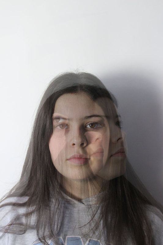
Different views of a person
This assignment was about different views of a person showing their facial features and hands. My WWW is that i captured the images in focus and i made a gif of them however my EBI would be that i want them to be more abstract and close up.
|
|

|


Different views of a person - Home response
This response was homework and I completed it with natural light, a high shutter speed. My WWW is that the photos are in focus however my EBI is that I want to create a response with more abstract photos of the person because then that will match Lauren Marek's style more..


Fireworks in a jar
Today we captured the work of Alberto Seveso. We put ink in water with oil, and used a high shutter speed and continuous shooting to take photos. Then edited the brightness and contrast in photoshop. My WWW is that i think i created a good gif and my pictures turned out well however my EBI would be that I want to mix different colours, like prime colours.

|
    |


Alberto Seveso
|
Alberto Seveso is a self-taught Italian graphic artist and illustrator, who was first inspired by artwork on skate decks and music album artwork. His unique pieces have been featured on the covers of magazines and CDs around the world, and he’s collaborated with big names such as the temper trap amongst many others. Alberto is probably best known for his portrait work and experiments using ink and high-speed photography. He called himself “someone playing with softwares, hardwares, coulors and creativity” 
|
|


Fireworks in a jar - Responce 2
These photos of fireworks in a jar worked more effectively than my response one. My WWW is also that i use more mixtures of colours and also used continues shooting for my gif. My EBI is that i want to get more close ups of the images. As well as this this lesson we did not use oil in the water and i think it worked more effectively.
To edit the photos on photoshop i used the burn tool to create darker contrast on the images. As well as that i used adjustments then the levels histogram to edit the brightness and contrast. I like the burn tool however it creates a very grainy look for my photos and I wouldn't use it all the time.
To edit the photos on photoshop i used the burn tool to create darker contrast on the images. As well as that i used adjustments then the levels histogram to edit the brightness and contrast. I like the burn tool however it creates a very grainy look for my photos and I wouldn't use it all the time.

|
   |


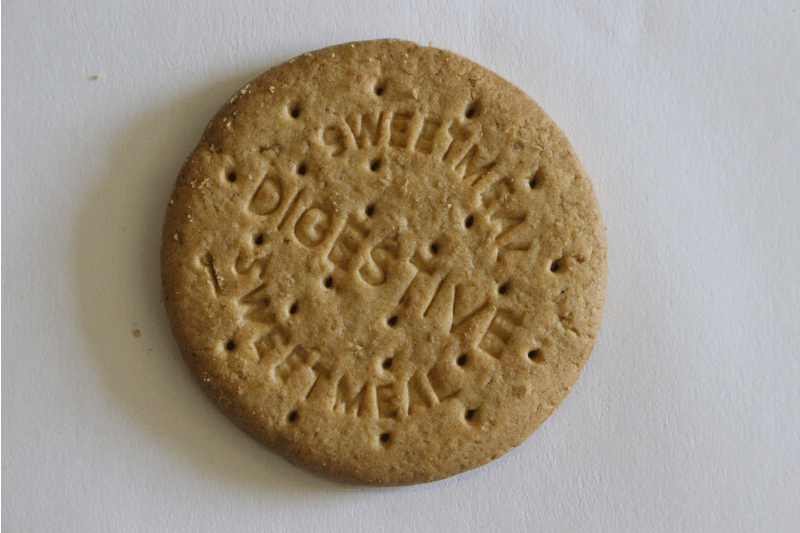
Lockdown Sequence
Today we have been creating a lockdown sequence, it is inspired by the work of Luke Stevenson who also creates food and animal sequences. My WWW is that i used a good lighting and also edited them in photoshop, i edited the brightness and cropped them. My EBI is that i would like to use more than one biscuit and try different sequences.
|
|


Luke Stephenson
|
Luke was born on New Years day, 1983 in Darlington, North East England.
Life in Britain and the British psyche are at the core of Luke's work. He photographs what to many epitomises the eccentricity of Britain. Often humorous in their outlook, his series range from prize budgerigars to the World Beard and Moustache Championships. Whether animate or inanimate objects, Stephenson creates affectionate portraits of his subjects and documents worlds often hidden from the mainstream. He graduated in 2005 and has worked as a freelance photographer since. The same year he was awarded the Jerwood Photography Prize. |
|


Lockdown Sequence - Response 2
For this assignment we developed our response one to lockdown sequences, this time i used two busicuts and when i put them together i edited and formatted them. My WWW is that i can clearly see the sequence which is happening to the buiscut however my EBI is that i want to create a gif that flows more.
|
|
|


Development
For this topic we will be developing and exploring topics that we have already done or other ones. The two that i have chosen are distortion and different views of a person. Distortion will include striped or swirled, stripy backgrounds and glasses, i also want to include images of people distorted through a glass. And different views of a person will be created by several images of a model which i will then print in black and white and cut and stick to fit each other. Distortion will be based of the work of Steve Purnell and Different views of a person will be based of Jesse Draxler.
Distortion
Steve Purnell
|
Op Art or Optical Art was a short lived art movement of the 1930's. It is a style of visual art that makes use of optical illusions. Major exponents of this type of art were Victor Vasarely and Bridget Riley. These images we called Steve Purnell's "humble attempt to create artworks in this style"
My first development project will be inspired by the Op art movement, I will be using a similar black and white background and a mixture of different sized glasses to create the illusion affect. |
|


|
These images to the right are the unedited pictures I have taken for the distortion development project. They were taken with a black and white background creating and optical illusion even without the glass in front of it. The picture was upload onto a 34" TV to make a large background. and each glass was photographed separately filled to the brim with water.
I changed the height of the base of each glass depending on the height and size of the glass as I wanted the main focus of each photo to be the middle of the optical illusion so the main distorted area had to also be that same point. This all meant that the viewers eye was drawn to the centre of each picture, out of the 13 pictures the best nine will be chosen and will be put into a sequence together, as well as this I will edit them in photoshop to create a brighter picture and one with more contrast between the black and white stripes of the optical illusion. Creating the final project. |
|


These photos are my distortion project put together as a sequence. They are in a grid of nine to draw the eye to the middle of each picture. As well as this I have edited the photos in photoshop using the following tools: brightness/contract and levels. These tools have created brighter pictures with more contrast between the black and white stripes on the background. Each picture uses the same background to give them something in common however each picture has a different glass filled with water to the brim distorting the background.


As well as putting my distortion pictures into sequence of nine i have layered them over the top over each other and brought down the opacity (all done on photoshop) to create a layered and supernatural affect. I have also found this affect in my other project, different views of a person, them having something in common brings together m development project. As well as this the pictures are even more distorted. Overall i am very happy with the outcome.
Different views of a person
Jesse Draxler
|
Jesse Draxler grew up in a rural town in Wisconsin, where he found out he was colour blind. Draxler released the book Misophonia, and created or starred in many exhibitions. Jesse Draxler is a mixed media and multidisciplinary artist, and his pieces combine painting, photography, collage, typography and digital painting. He's work is very abstract and all in grayscale, the images he treats uses the human arm for example silhouettes and then distorts them into different characteristics. He says that much of his work "involves directly translating what I hear into what I see."
For my second development topic I will be experimenting with Draxkers unique art form and hoping to even recreate some of what he's work is all about. |
    |
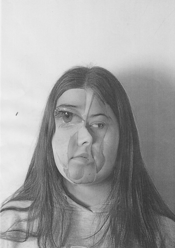
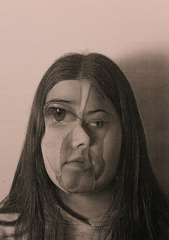
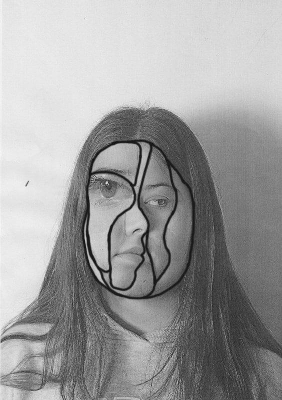
The following three photos are my project for my second part of development, i chose to develop the topic of different views of a person because i find the facial structures and close up images interesting to capture. The first picture is my end result made by hand then photocopied onto plain A4 paper this gave the image a clean and grey look to it. The second image is my end result also however this picture i have photocopied onto an A4 sugar paper. The sugar paper gave the image a slightly orange affect and created more depth that the plain paper, this meant that it created a slightly different outcome. I feel that it is important to compare the two which is why i have stationed them next to each other. The last photo is also on plain paper however to emphasize the different parts of the face I have used the brush tool on photoshop to create a dived between the new and old parts of the face. This makes the line to be bolder and stand out more meaning that they contrast more with the original face.
|
|
|


|
These are the raw images I took to create my project. One thing i would have done differently about these is take them from more angles and with different emotions. One thing Jesse Draxler does is that he captures the emotions of a person inside a silloutte this is something i think should have explored more starting with these photos.
|

|
This image was taking my development (different views of a person) slightly further. One thing i stated at the start of this topic, domestic objects, was that i found photoshop hard and it was something i needed to work on. Throughout this topic i have developed this skill. This picture was created by me on photoshop using the same pictures i have used throughout different views of a person, however instead of making the image by had (physically) i challenged myself to complete it digitally. This gave the image a slightly supernatural affect that i would not have been able to achieved by hand. As well as this the picture has more layers to it than the other pictures. Overall development has developed my understanding of photoshop and photography a lot.
