Fragments Printrest Board
Fragments is the last topic in this photography course, to me it is all about the smaller parts to a bigger picture. This could be shown through a jigsaw puzzle a cracked mirror or lots of photographs or images put together. All of which are shown on my mood board for this topic. As well as this fragments can be both broken apart or put together showing the varied options within this topic. I am aiming to use lots of color materials and tequnices through this topic.


Summer Work - Set Tasks
David Hockney Exhibition


This summer i visited a David Hockney exhibition, called A Year In Normandie. As the world stood still during the successive lockdowns, Hockney depicted in the manner of the Impressionists the effects of light in the Norman skies and the arrival of spring around him. Confined in his typical half-timbered house of the Pays d’Auge, he captured the blossoming of nature and painted its variations with bright and colourful hues using the digital brushes of his IPad – a technology he has been using for the past twelve decade. In the end result you could see snapshots (Fragments) from different seasons blending into one another, to be more specific 220 snapshots put together and shown at continuous length. This project was inspired and based off of The Bayeux Tapestry.
The Bayeux Tapestry created in the 11th century, within a few years after the battle tells the story from the point of view of the conquering Normans but is now widely accepted to have been made in England is nearly 70 metres (230 ft) long and 50 centimetres (20 in) tall. This is similar to Hockneys project which is 90 meters (295 ft) long.
The Bayeux Tapestry created in the 11th century, within a few years after the battle tells the story from the point of view of the conquering Normans but is now widely accepted to have been made in England is nearly 70 metres (230 ft) long and 50 centimetres (20 in) tall. This is similar to Hockneys project which is 90 meters (295 ft) long.
Deconstructing Objects - Todd Mclellan
|
|
Todd McLellan is a photographer and fixer from Canada. He was formally educated in photography at the Alberta University of the Arts but gained the bulk of his knowledge working in the field. Todd has been exploring with photography for over 20 years and has traveled the world with his work. Todd works both in the commercial photography/motion world as well as developing his personal work. I will be using McLellan as my inspiration for this project.
|


|
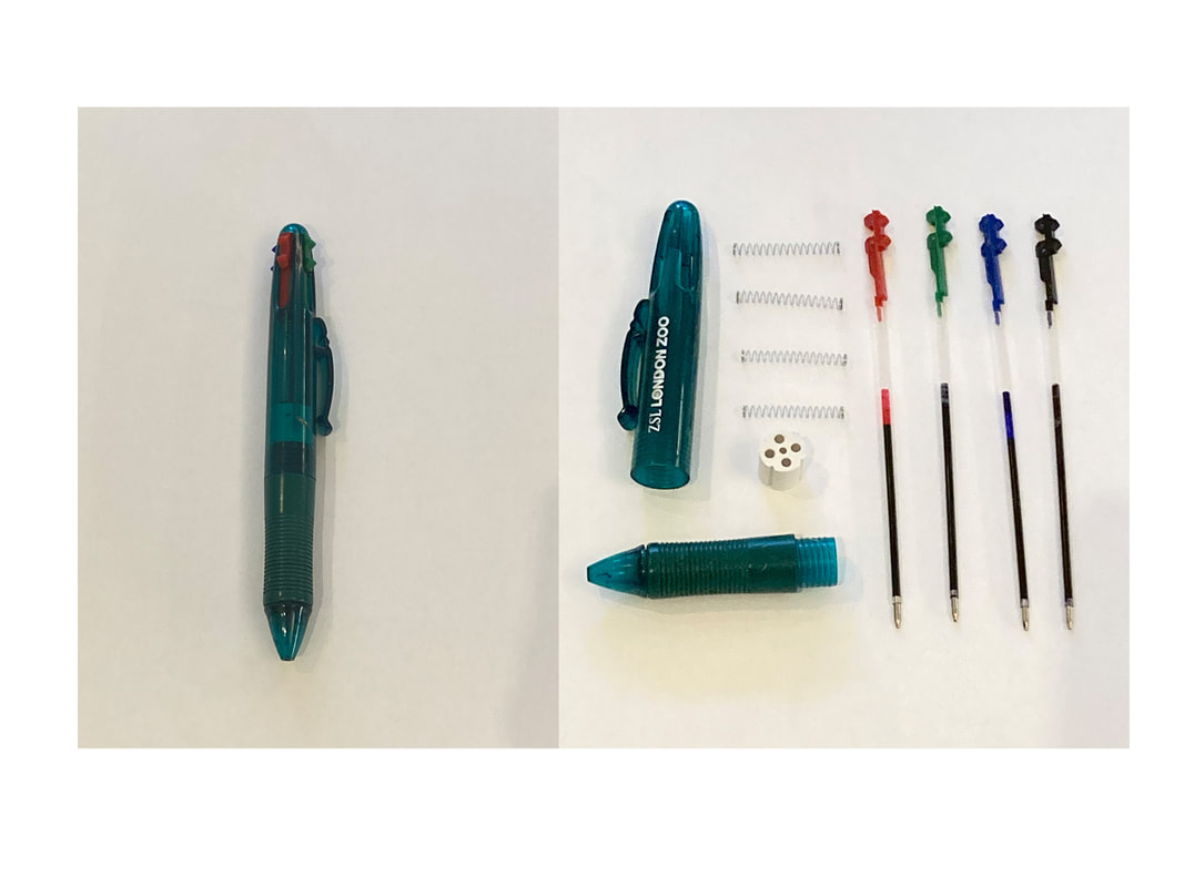
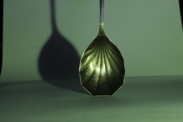
For this assignment i took apart a pen with 4 different colours and layed them out, I think that there is a definite correlation between my end result and Todd Mclellan however his work is more complex and uses photoshop to create his work as well. My EBI is that it is really simple, when I complete a second response I hope to use a more complicated object and capture it from different angles. |
Water
|
|
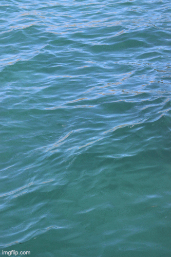
These photos are from Pinterest, where i will be taking my inspiration form for this project that i will complete. The photos are close ups of water from the sea, a lake and a puddle. I aim to capture different angles, lighting and textures of water. |


|
For this subtopic, water, I created three pieces. One being a gif of water showing the movement and the caoticness of water. Also i photographed a person in water which included different colors and contrasting actions. The natural movement of water against the swimming human demonstrates those contrasts. As well as photographing the sea i also captured images of a pool in some pictures showing calmness and in others movement. Also the colors in the swimming pools where different to the sea but all similar. Overall I really like my images. My WWW is that i have taken a range of different photos all of which i can talk about differently. And my EBI is that i could have used different camera techniques for example long exposure or slow shutter speed to create different effects. |


Set Tasks
David Hockney
|
David Hockney is an English painter, draftsman, printmaker, stage designer, and photographer. He was an important contributor to the pop art movement of the 1960s. Portrait of an Artist became not only the most expensive work by Hockney at auction when it sold at Christie's in New York on 15 November 2018 for £70.1 million.
He was born on the 9 July 1937 in Bradford, making him 84 years old. I like David Hockney's work because it is abstract and creative, i think lots of people can be able to do it as well using different medias, for example online in photoshop or on paper using printed out photographs. |
|
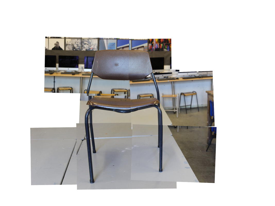
David Hockney photo joiners, First Responce
To be able to make the David Hockney photo joiners the first step is to go to File > Automate > Photomontage. Then select collage and deselect photo blend. From browse upload the photos you want and select ok. You will then be able to move photos to where you want to create your photo joiner.
|
    |
Today we looked at David Hockney and his photo joiners. We photographed a chair and used photoshop to position the several images so that many photos are made to look like one.
First you take photos of your objects from different perspectives, then put them into photoshop. In photoshop you File > Automate > Photomontage. Make sure to turn of blend photos. Then move around your layer and put into the right position.
I think mine has turned out well and you can tell that it is one object, a chair. However next time i would like to practice making a photo joiner by using pictures of a person, a more complicated object or even a still life scene.
David Hockney Second Response
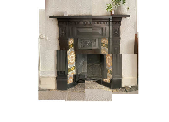
Today we did the second response to the David Hockney photo joiners. It was quite hard however i think it went well, my WWW would be that you can tell the image that is i have attempted to create. However my EBI would be that the mosaic patterns on the fire place do not fit together and if i ever redo this price i would want to fix that.
|
|


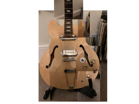
David Hockney, Home Response
For my home response I decided to use a guitar. These meant the images fit well together and after practice at school I didn't find them it too hard to complete.
My WWW would be that the image has worked well and that it is a representation of David Hockneys photo joiners.
My EBI is that the background is not in focus because I had to re size it bigger that the photo I took, this is a small detail which could be improved, also the background doesn't line up.
Andre Kertész
|
André Kertész, born 1894 Kertész was a Hungarian-born photographer known for his groundbreaking contributions to photographic composition and the photo essay.
Kertész never felt that he had gained the worldwide recognition he deserved. Today he is considered one of the seminal figures of photojournalism. Hungarian-born American photographer known for his lyrical and formally rigorous pictures of everyday life. I will be basing our next project off of his work, called form over function. |
    |
Form over Function - First Responce
This lesson was the first lesson trying to recreate the Andre Kertész fork pictures. I think mine went well and the you can see shadows being different things, form over function. However next time i would take photos from different angles. For example not just above, lower down and from a birds eye view as well. Also make sure my photos are in focus.
Also i turned a photo into black and white:
When tuning these photos into black and white I found that there was only a subtle difference in the picture as they were already colourless however I liked the cleaner look it gave it.
Also i turned a photo into black and white:
When tuning these photos into black and white I found that there was only a subtle difference in the picture as they were already colourless however I liked the cleaner look it gave it.
|
|
|


Form over Function - Second Responce
|
|
The photos i took for my form over function second resoponce weren’t just forks, i brought in items from my home and used them as well to create interesting shadows which could be over things. For example you can see a whisk and sunglasses in my pictures.
My WWW would be that some showed interesting shadows and i am getting better at manipulating the torch/light to show it. However my EBI is that some photos are very blurry, same as my last response i need to improve them. And and could be taken better I also need to work on my close up shots. |
Form over Function - Third Response
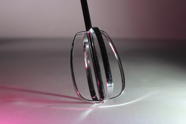
Today we experimented again with using the form over function using shadows, however today we used coloured lights to reflected shadows and also made gifs using the photos we've taken. By only photographing one side of the cutlery or with a particular lighting, it fragments how they look.
WWW: I think that the colored lights played a significant role in stepping up my photos, the colors are reflected off the silverware and make the image very cool.
EBI: Next time i want to make sure only the white background is shown and make the photos or gif look more finished and professional.
WWW: I think that the colored lights played a significant role in stepping up my photos, the colors are reflected off the silverware and make the image very cool.
EBI: Next time i want to make sure only the white background is shown and make the photos or gif look more finished and professional.
|
|


Chad Pitman
|
Chad Pitman is an American photographer discovered his interest in image making at an early age through his father's photography. He went on to study colour theory and photographic arts in Boston after which he moved to New York. His trademark style includes the application of paint to photographic prints and high sensitivity to colour.
|
  |
Lauran Marek
|
Based in Texas, Lauren was a freelance photographer. Proficient in editorial, lifestyle, portraiture, and social campaigns. Lauren Marek documents the everyday through photographs and video, focusing on her intimate relationships with friends and family. |
|


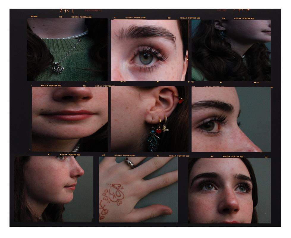
Different Views of a person
This assignment was about different views of a person showing their facial features and hands. My WWW is that i captured the images in focus and i made a gif of them however my EBI would be that i want them to be more abstract and close up.
|
|
|


Different Views of a Person, Home response
This response was homework and I completed it with natural light, a high shutter speed. My WWW is that the photos are in focus however my EBI is that I want to create a response with more abstract photos of the person because then that will match Lauren Marek's style more. I also created a Chad pitman style boarder, this however squished my photos.


The Geometric Portrait
Gorden Magnin
    |
Gordon Magnin is a Nevada based artist and lives and works in Southern California. He works in photography, scans, collage, and altered found image. He loves to use geometry, pattern, repetition, form, perspective, composition, and systematic operations as methods to distort and challenge the intended objective, interpretation, and significance of consumer based images. However after receiving his Masters Degree from the Southern California Institute of Architecture, a bachelors of science in structural engineering from the University of Nevada, Reno, and completing studies at the Mountain School of Arts, Gordon finds himself in a city that is visually influenced by celebrity and Hollywood advertising. His use of black and white coloring accentuates the features of the face even further due to the quality and use of shadow in his photographs. |
Response 1
|
|
For my first response I photographed my model from many different angles and picked out one photos where I could see the majority of the models face as well as having good angle. Then I took this image into photoshop. In photoshop and first patracticed which different shapes and arrangements. The two outcomes I came up with I used a selection tool then copied the shape into a new layer and moved its placement/angle. After I had done this several times I merged and flattened the image and made it grayscale. In the second photos of the circles I also lowered the the opacity of each of the circles as I went on.
MY WWW for these photos are that I think I have learnt lots about photoshop and layers and I love how they turned out, especially the one on the left as it shows different perspectives on the face. MY EBI for these photos is that I want to create a moe complex image with more subtle arrangements. |

|

|
Response 2
|
|
For my second response I wanted to improve the complexity and that is what I did, I made many circles and layers them and turned them each a few degrees to give a spiral effect. I chose this picture because in my last response I chose an image of a person at an angle and this time I wanted to experiment face on. My WWW is that i love the outcome and it is destorting the face in a more sutble way compared to my first response which i like, as well as this i like how part of the model's face is still showing. My EBI is that i want to use a photo which is more zoomed in on a models face or cropped so it is closer. |
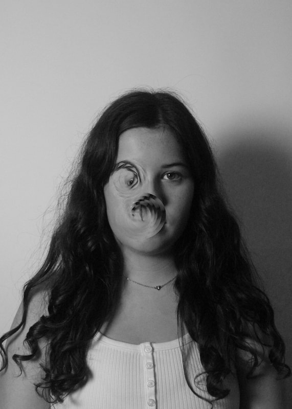
Cosmic Surgery
Alma Haser
   |
Born in 1989 into an artistic family in the Black Forest, Germany, Alma Haser is now based in London and on the southeast coast. She is known for her complex and meticulously constructed portraiture, which are influenced by her creativity and her background in fine art. Alma creates striking work that catches the eye and captivates the mind. Using origami and a camera she has been creating a series called cosmic surgery. This is what i am going to be basing my next project on.
|
Response 1

|
The picture to the left is the best of my ten photos I got for my fist response of this series. To make the image I first photographed my model, then printed it out twice and used one to create the 3D shape. I did this by creating the net of the shape and cutting it out with flaps to stick it together. After I did this I then placed the 3D shape on top of the photo and photographed it from different angles and with different sides showing. My WWW for these photos is that I like how part of the face jumps out at you and is more prominent, whereas the rest of the face and body looks as like it is out of focus. My EBI is that the photo looks quite dark so next time is should use a light to take the photo or I should edit it in photoshop. As well as this i should have lined up the 3D shape more precisely. Overall i liked this project more on photoshop than using physical materials. |
Chris Killip's Gallary
      |
Chris Killip's continued efforts to value and document the lives of those affected by the economic shifts in the North of England, throughout the 1970s and 80s, have made him one of the most influential figures of British Photography. He photographed fragments or life which he saw.
This retrospective exhibition of more than 140 works, serves as the most comprehensive survey of the photographer's work to date and includes previously unseen works. Overall i really liked this gallery as the photographs showed depth and meaning. I also like how they all linked and they were all in black and white and none of them where perfect. |
Simplified Images
|
|
To make a simplified image you upload the image to photoshop then the next step is to click on the lasso tool in Photoshop and select the Polygonal Lasso Tool. Then highlight your chosen shape by clicking the tool around the shape and then return to the point that you started at. When you have done this the shape will show as being highlighted. When you have selected the shape Click on Filter > Blur > Average. Finally work your way around the picture selecting all the different shapes.
|


|
I think this lesson has gone well, the gif works well and the colours match, i also like the gif i created using my simplified image. Most of the picture is coloured and it does look like the building only simplified. Next time i don't want to miss out a part like i did on this picture and also I want to do a more complicate image that isn't a building like a landscape like mountains.
|
Paul Eis - mixed architecture
  |
He was born 1998 in Berlin. After finishing school in 2016 he moved to Austria to study architecture at the University of Arts and Industrial Design Linz.
He was interested in architecture since his childhood. He always had a fascination for towers, bridges and other spectacular buildings. Later, when he discovered photography, he got more into architecture and the built environments around him. |


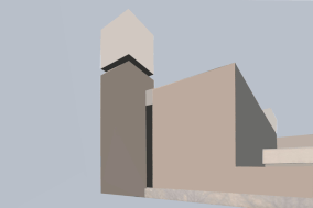
To replicate the Paul Eis - mixed architecture - I used colour to go over fragments of buildings. I chose contrasting colours for each picture so that they stood out better. My WWW is that the buildings look artificial with even a slight colour change which is something you notice when looking at the work of Pal Eis. My EBI is that next time I want to use a more complicated building and more than two colours.
Patrick Cornillet
|
|
Patrick Cornillet is a French architectural painter born in 1968 in France. Cornillet resides and works in Nantes. His recent work features austere constructions in empty surroundings. Fragments of architecture left in the center of the painting, in suspense by its visitors. His works capture their spectators in an illusory space. Because of this the viewer struggles to give an interpretation to these concrete structures. Unclear is if these structures have ever served a purpose other than confusing its viewers. Cornillet’s more recent work can be viewed as ‘severe’ or ‘naked’. Similar to his previous work a feeling of motion is perceived in these structures. These images evoke the ruins of a fallen society, standing as naked as fragmented. |


These images were photographed and edited at my school, the buildings here are modern which helps with this topic. First, i took about 20 photos then edited one with a plain white background and another with clouds, and a slightly greyscale background. My WWW for these images is that i like how (especially in the grey/cloud background one) they look as though they are floating. My EBI is that they could have been edited/cut better and they have very harsh edges which i dislike and create a big contrast and as though they are out of place.
At home Response


This time i created my response at home, to get my raw photograph i went into London and searched for a modern building, this is the best one that i found. However one challenge was that there was a big gate in front of it so the photograph could only be used at a certain level. Also i took the photo on my phone on a camera. Then at home i edited the photos, again one with a white background and one with a grey/cloudy background. For the one with a grey background i first turned the whole photo greyscale and then changed it just to be the background as i think it works better with contrast between the building and the background.
My WWW is that it is simple and effective and i made the cut of the building on photoshop very clean.
My EBI is that the picture is very boring as the building is just at the bottom and i don't know what to do with the empty space.
My WWW is that it is simple and effective and i made the cut of the building on photoshop very clean.
My EBI is that the picture is very boring as the building is just at the bottom and i don't know what to do with the empty space.
Mauren Brodbeck
   |
Mauren Brodbeck was born in Geneva, Switzerland. She trained in screenwriting, production and filmmaking in Canada. She is a Swiss multisensory artist and singer-songwriter, uses visual and auditory elements to create startling reinterpretations of common objects and experiences. Her multidimensional works invite her audience to step outside their safe and familiar realities and reconsider their relationships with the people and environments around them.
|


For this assignment i responded further than Patrick Cornilllet and moved into Mauren Brodbeck. I used the same photos to recreate her photoshopped buildings, with block colour i created the first one (the blue one) at first i found it difficult but once i got the hang of it i moved onto my second one and decided to edit it slightly in my own style. For example i lowered the opacity so that some of the building still had colour showing through but there was texture. Also i edited finer details with block colour, for example the windows.
My WWW is that i like my outcomes and how they represent Mauren Brodbeck's work, one also has been developed further into my own style.
My EBI is that , especially in the first one, the edges are not lined up perfectly with the building. Also a larger range of colors could be used on more photos if i wanted to do this as a project or just extend the project.
Half Term Work
Gallery Visit - Simon Roberts
   |
"Simon Roberts is one of the most acclaimed contemporary photographic artists working in the UK today. He is renowned for his nuanced enquiries into diverse conceptualisations of personal and collective identity, and in particular, how our human relationship to landscape informs our sense of belonging and selfhood." - Flowers Gallary
I really enjoyed this gallery visit as it gave me a different understanding of photography, such that using different mediums together and mixing textures. I felt as though you could only see part or fragments of the sculptures because of the film over the top. |
Independant project start
Inderpendant project 1
Nicholas Kennedy Sitton
    |
“These photos are a result of how intriguing the concept of distortion translates to architecture. It creates a sense of falling into itself, like capturing a moment of demolition. I can destroy titanous steel structures with the click of a mouse and create new twisted versions of reality. I was also inspired by San Francisco. I had just moved here and being a new city was disorienting and exciting and I wanted to capture how my whole world had changed.” – Nicholas Sitton |
Response 1


Inspired by Nicholas Sitton i created these distorted building images. One which was similar to the geometric portrait work by Gorden Magnin and one which was a more creative image. My WWW is that i really like the colours that contrast the sky, especially in the one to the left i like like how the edit is not just over the building but also in the sky and overlapping the image using the wrap tool. My EBI is that they could be more complex as i have done edits like this before and they were not the hard.
Response 2
For my second response, developing the work of Nicholas Kennedy Sitton, i decided to continue adding and distorting the images in photoshop with the wrap tool. My WWW is that i distorted more than one section of the image and experimented with perspective. However my EBI is that again it is not very interesting or complex. I haven’t really got into this project or developed it very far. If i ever did it again i would challenge myself to distort a large section of a building.


Independant Project 2
Daria Kosinova
   |
Daria Kosinova uses a fish eye lenses to create distorted images of people. What stands out in her photos is the creativity of the peoples clothes and the color. I want to use her work as inspiration and use a fish eye lens to photograph both buildings and people using a fish eye lens to create depth and a larger perspective.
|
Response 1


|
For this second independant project i wanted to do a completely different idea: use a fish eye lens. There are three ways i could do this: 1. by using an attachment on to a camera (i don't have one). 2. Using an attachment onto a phone (i have one) 3. edit a photo without a fish eye lens on photoshop.
After taking a simple photo of a person a white background forma high angle i put it into photoshop and used the warp tool to edit it like a fish eye lens after a lot of experiment. After that i then added it the normal edges which come with a fish eye lens tool, the black curve on the edge to turn it even more circular. My WWW is that i like the outcome and how i managed to create it in photoshop as in that moment i didn't have any fish eye lenses. It turned out very similar to Daria Kosinova. My EBI is that next time i ant to try it from a low angle like some of Daria's pictures. Also i want to try with buildings and landscapes using the fish eye not just people. |
Response 2


|
|
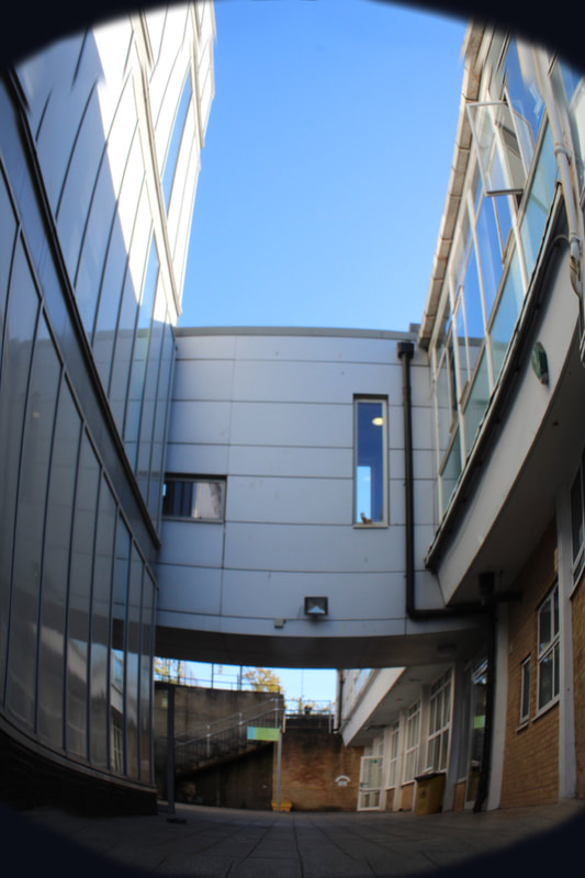
This response i focused on photographing buildings from a low angle and then putting the image into photoshop to edit them like a fish eye lens. One thing i did differently to last time is: when editing in the black circle using the the history remover tool to faintly edit out the edges, this gives it more of a natural effect and more like a real fish eye lens unlike last response where it looked very blocky. I took 15 photos and chose this one because it was at a long angle from the ground, good quality and worked well when edited.
My WWW is that i like the outcome and how the edges of the building move like how they would in a fish eye lens they curve with the edges of the image.
My EBI is that i want to use a real fish eye lens next it me, one which either clips onto my phone or a camera lens.
My WWW is that i like the outcome and how the edges of the building move like how they would in a fish eye lens they curve with the edges of the image.
My EBI is that i want to use a real fish eye lens next it me, one which either clips onto my phone or a camera lens.
Response 3


For my third and final response before deciding what to do for my independant project i took pictures using a fish eye lens which clips onto a phone. This meant that i didn't have to take images and then transfer them to photoshop to edit them. I took photos from a high angle and a low angle. My WWW is that they are starting to become more natural fish eye lenses, the photos are also distorting reality and animals which is very weird to look at but makes a good outcome. My EBI is that next time i want to use a fish eye attachment to a camera, have a human subject and use colour.
Independant Project - Fragmenting Reality - Using a Fish Eye Lens

Development 1
Experimenting with a fish eye lens - Nature
      |
For my first response for my independent project i am using Pinterest as inspiration. I have found photos of flowers, trees and the sky (nature) photographer, distorted and fragmented through the fish eye lens. This caught my eye because the colors are bold, and obscuring nature is very interesting. One problem with this inspiration is that it is winter and most flowers are either wilting and lost color or completely dead. As well as this lots of tree have lost leaves. Despite this i am going to experiment and develop this idea.
|
Response 1


|
|
This response i used a fish eye lens attachment to a camera, it was a whole different skills just photographing the photo then editing it on photoshop. For example i needed to make sure my feet and hands were out of the frame, which is easy to not do as the lens is so wide and captures a massive angle. Also i needed to get really close if i was capturing a flower for example as you can’t zoom. My best photo for this response was a close up of a flower with water droplets. I edited it in black and white and with a different color balance. This shoot was hard as i took it in school, where there were not many flowers and it was a very wet day. My WWW is that i have learnt how to use the fish eye attachment and also captured the flowers and bushes i could find. My EBI is that i should practice on the sky on a clear day with clouds if i can’t find flowers. Also i would like to practice on people. |
Response 2
|
|
For my second response for fragmenting nature, i went into my garden and photographer the plants, the flowers and the food pots (tomatoes). I took six photos from a birds eye view, above and six photos from front on. I did this to show how the fish eye lens distorts them differently. The two photos without a border are still taken with a fish eye lens but a different attachment into the camera. I think the photos that worked the most effectively was the front on photos of the purple flower, this is because each flower was a different distance from the camera and the fish eye lens distorted them giving them a wide angle with a depth of field. For this response my WWW is that i learnt a lot about how ot use effectively the fish eye lens and also came out with some good photos of nature with colours and from different angles. My EBI is that as it is winter it may be more effective to take photos of humans or buildings because there are not very many flowers of plants out with lots of colour. As well as this i want to try and use more camera skills for example aperture or shutter speed to create a more interesting picture. |


Development 2
Fish eye lens nature - Part 2
|
To continue fragmenting nature through a fish eye lens, i went to a flower market and photographed all the different types of flowers, colors and sizes. Each flower was unique especially taken through a fish eye lens. My WWW is that i now have a gallary of fish eye photos and i can put them into a gif. However my EBI is that the flowers are not very exciting and there is not much i can do with them. 
|
|


Fish Eye Experiments - Nature
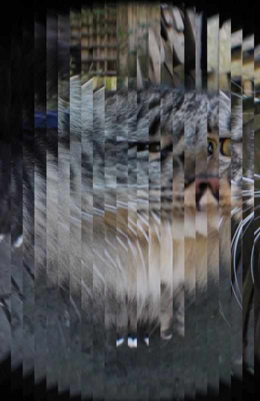
With a fish eye lens, I experimented with the nature in my back garden and my cat. I photographed from many different angles and in different lightings. I used a fast shutter speed to capture the movement. When the cat was the main focus in the middle of the image the nature around him was fragmented and distorted. My WWW for this is that I learnt a lot about the fish eye lens, I really like these photos and I now have decided I like having a subject in my photos instead of just nature or buildings. My EBI is that I want to start focusing on people and then further editing my photos.


Further Fragmenting my photos
Development 3
Richie Igunma
|
The photos to the right were taken of the artist REMA by Richie Igunma, he’s a creative director and photographer. These photos are going to further inspire my fish eye lens photography, moving from nature to humans i want to use colour and angles just like Igunma did.
|
   |
Response 1
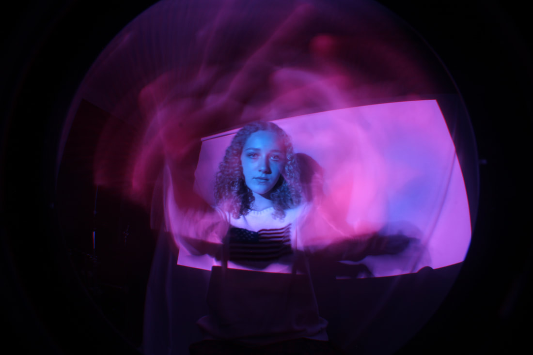
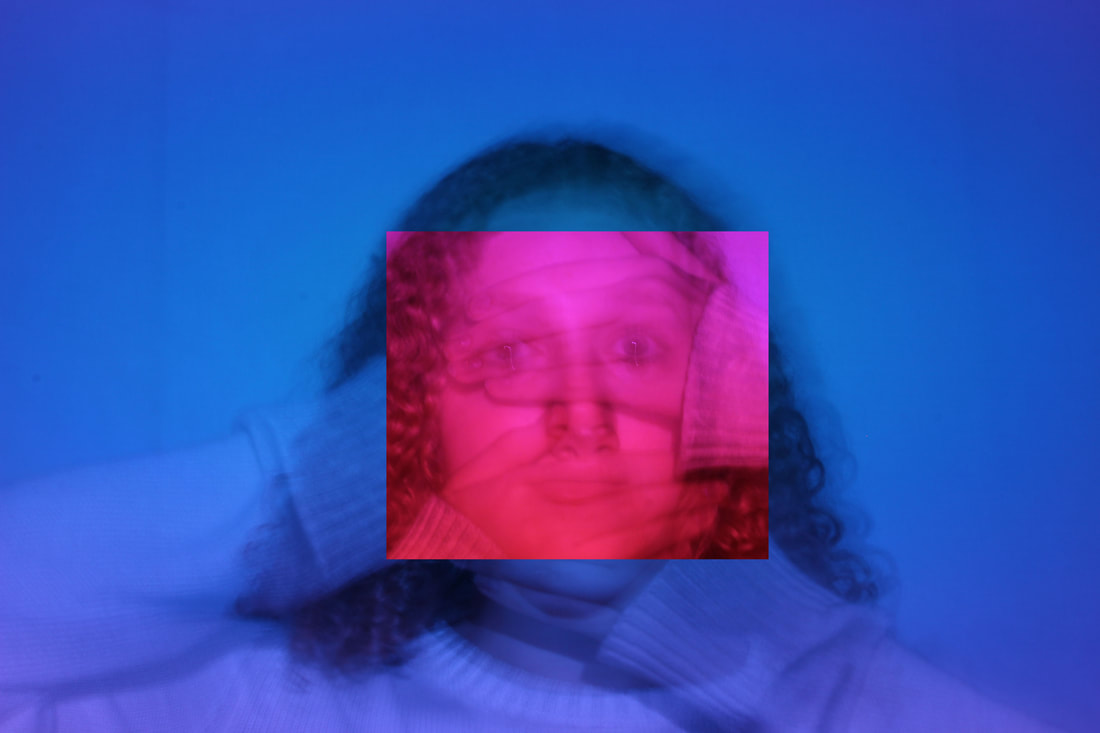
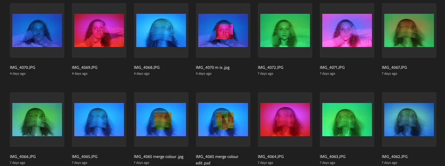
Moving on from the nature to use my EBI last time i have decide to now use people as the main subject of my pictures. For this response i based my idea off of Richie Igunma, who uses the fish eye lens, lots of colour and close up to create his images. to make my set up i positioned a white sheet hanging from the ceiling, thin closed all the blinds and used a projector which faded through different colours . As well as this i use a tripod to keep my camera steady, especially from the slow shutter speed photos.
For the top left photo to the right (one of my favourites) the model kept her head extremely still and moved her hands around in a circular motion following the edge of the fish eye lens. This created a very cool effect of different parts of her. The photo underneath that was taken with a very fast shutter speed from a low angle. In this shoot i played around with different colours, different angles and different poses.
The WWW for this project is that i the final pictures are very cool, i used lots of colour and used different camera settings. The pictures are very similar to Richie Igunma's style, which i like, but with my own twist. The EBi is that i want to try and get some pictures without the background without the non colour background, this meaning a closer shot.


|
|
To make my photos look even more like 3D, I edited it on photoshop and moved colours around in the photo. 1. Make a copy of the background layer 2. open the blending options in the bar uno the layers 3.Then urn off he colour combination you do not wan to adapt. For example, turn of red (R) and green (G) if you want to adapt blue (B) 4. It won't look changed but if you turn the visibility of the background layer off the the picture will appear the only colour left turned on. 5. Then use the move too while on the adapted layer and move the mage slightly in the direction you want to be nudged. |
Editing (physically and on photoshop) my photos even more fragmented - Development 4
Response 1 - Alma Haser
|
|
Born in 1989 into an artistic family in the Black Forest, Germany, Alma Haser is now based in London and on the southeast coast. She is known for her complex and meticulously constructed portraiture, which are influenced by her creativity and her background in fine art. Alma creates striking work that catches the eye and captivates the mind. Using origami and a camera she has been creating a series called cosmic surgery. This is what i am going to be basing my next project on.
|
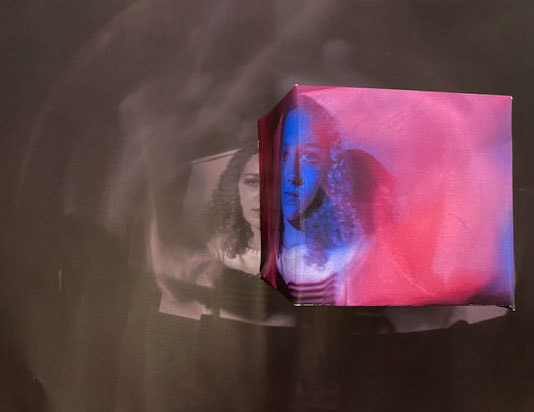
To fragment my image even more i decided to use a net of a cube to create levels and color our contrast in my picture. I traced around the net of a cube onto my colored image then used flaps on the edge, glue on the flaps and folding to make a cube. After this i then positioned the coloured cube onto a black and white copy of the same image. I photographed this and uploaded it.
My WWW for this response is the contrast between the colors in the image. Also the cube worked well and creates levels by being closer to the camera. My EBI is that the cube isn’t completely lined up with the image and i could have captured it from different angles and different sides of the cube.
My WWW for this response is the contrast between the colors in the image. Also the cube worked well and creates levels by being closer to the camera. My EBI is that the cube isn’t completely lined up with the image and i could have captured it from different angles and different sides of the cube.
Response 2 - David Samuel Stern
   |
Born 1982 Highland Park and now lives/works Brooklyn, NY David Stern has had himself many expiations, public and private collections and amazing weave portraits (which i will be basing this response off of). These portraits are all made up of two portraits cut into stripes then weeded into each other. He uses close ups of just the face and neck.
|


For my second response i weaved an image into one which was black and white. I first cut the images into many horizontal and vertical strips then i weaved them into each other. I really like this outcome as the photo is fragmented and has parts with lots of colour and parts without. My WWW is that the two pictures line up will. My EBI is that next time i would cut the pictures into more strips so that the weave is less noticeable, and it only creates a subtle difference.
Helen Robertson
  |
Helen Robertson’s practice could be described as object-images responding to painterly traditions of formalism, film theory and minimalism’s notions of objecthood. I will be using her works as an inspiration for my even more fragmented series. |
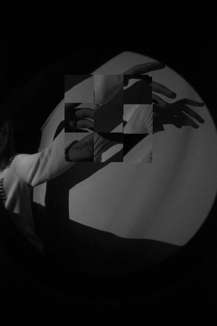
This Helen Robertson inspired image was creating using an image i had previously photographed in a shoot. It was created on photoshop using the tools. My WWW is that the grayscale gives the centre the main focus, my EBI is that the squares are not perfectly lined up.
Development 5
Slow shutter speed and colour - Inspiration - Pinterest


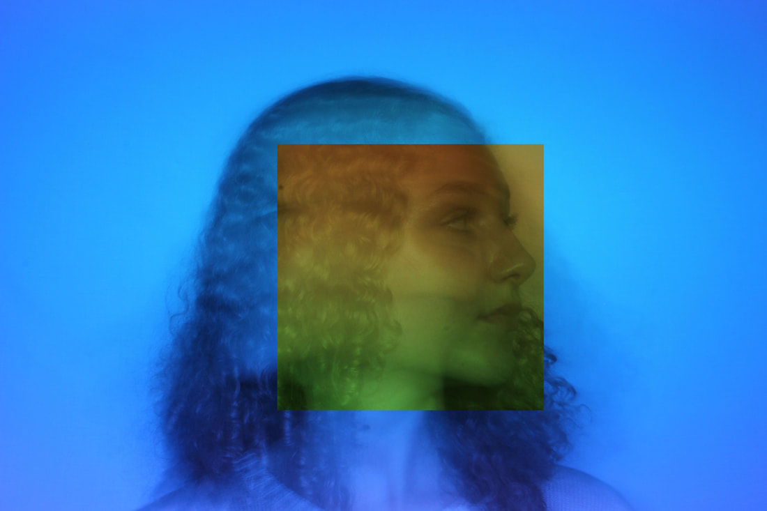
To continue with the colors i used i stopped with the fish eye lens and moved onto mainly using a low shutter speed; this gave a ghostly effect which we wanted. I used the same colours and background/setup as the last response. It took many try's for me and the model to get it perfect we had to count down so that as soon as i pressed the button she moved her head to the other side. After this we tried a similar thing but by moving the hands away from the face after i click the button for that there is the hands covering the face but with the eye's also on top.
My WWW is that i love the colours, using a tripod gave it a great effect as then all the nine pictures in the grid are the same height. My EBI is that i want to also try by photoshopping two pictures on top of each other to give the same effect.
My WWW is that i love the colours, using a tripod gave it a great effect as then all the nine pictures in the grid are the same height. My EBI is that i want to also try by photoshopping two pictures on top of each other to give the same effect.
|
|
Development 6
Szymon Roginski: sculptural photography
|
|
Szymon Roginski teamed up with fellow photographer Kasia Korzeniecka to create this unusual collection of photo sculptures. These photos were then re-imagined as three-dimensional sculptures. The photos were printed and then transformed into a variety of shapes and assembled back together to display the image. I am going to be using these images as inspiration for my final piece, creating an image from many different small images turned into cubes.
|


Response 1 - Paper
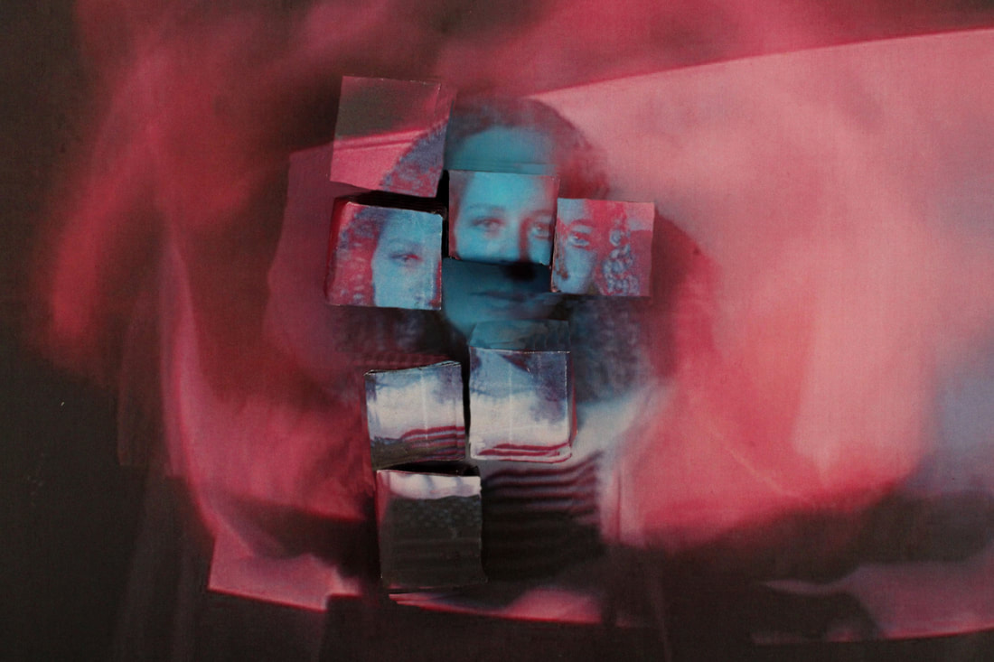


This development is a composition of lots of pictures inspired by Szymon Roginski. I first creating about 15 to 20 small boxes each face showing a different part of the picture. Then i played around with the positioning and the angle of the photo taken. I think Roginski's techniques are very similar to that of Alma Haser which have used before. After capturing my image how i wanted it i edited it in photoshop to get rid of the edges and make it look cleaner. I found this quite challenging as the boxes were difficult to make, they were small and i made them out of paper. However i like the outcome as it shows fragments, the circle of slow shutter speed made by the models hands and they square and sharp edges of the boxes contrast each other. My WWW is that it clearly shows fragments, has lots of colour, of which i wanted from the beginning and the initial image i took in the photoshoot is very cool. My EBI is that next time when making many small boxes i should use card.
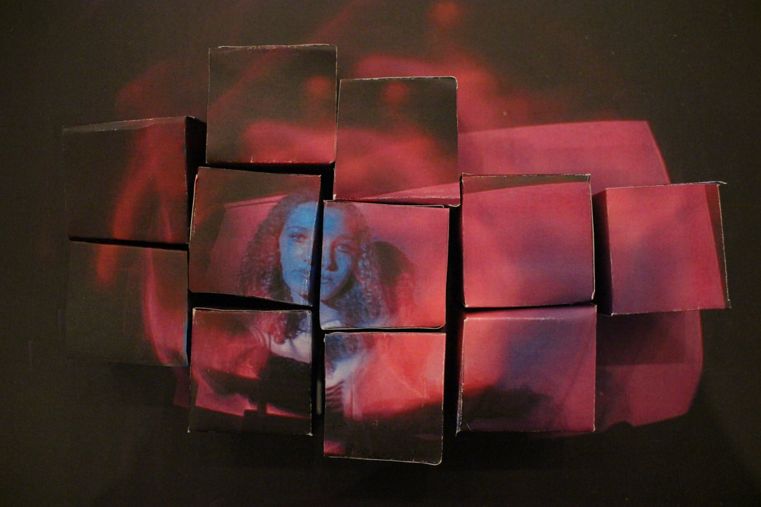
Response 2 - Card
For the second response I switched to using card to make my cubes, this meant I could make them quicker, easier and more of them as they were less delicate. I think this time it worked out better and it is definitely inspired by Szymon Roginski. I also tried to clean up the edges of the cubes on photoshop again however my EBI for next time is that I would do that in more depth.
Development 7 + Final Piece
Erwin Blumenfeld
    |
Erwin Blumenfeld was an American photographer of German origin. He was born in Berlin, and in 1941 emigrated to the United States, where he soon became a successful and well-paid fashion photographer, working as a free-lancer for Harper's Bazaar, Life and American Vogue. His personal photographic work showed the influence of surrealism; his two main areas of interest were death and women. He was expert in laboratory work, and experimented with photographic techniques such as distortion, multiple exposure, photo-montage and solarisation. I will be using his work for my final development of my fragments. When I further fragmented my nature ( + cat) photos I created a similar image, I will be father developing that idea with the inspiration of an artist for this development. |
Responce 1

|
|
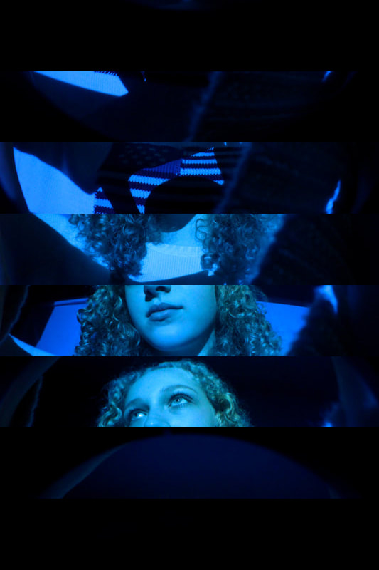
My first response of Erwin Blumenfeld created vertical fragments in my photo. I also made a gif to show the separate columns. My WWW is that the colour stands out a lot and it shows clear fragments. My EBI is that I would like to try it horizontally and with thinner sections. I could also try doing this physically or while I'm taking the photo with a mirror.
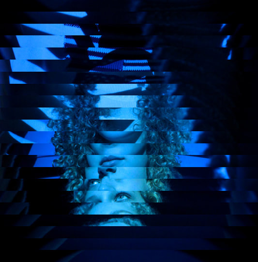
Responce 2
To contrast my first response I decided to develop it and make my second response vertical. My EBI is that I would crop the image so it is a cube not a rectangle so to get rid of the dark wasted space. I would also create smaller sections of fragments to make the image look more complicated and the effect more subtle.
Response 3 - Final Piece
|

|
|
|
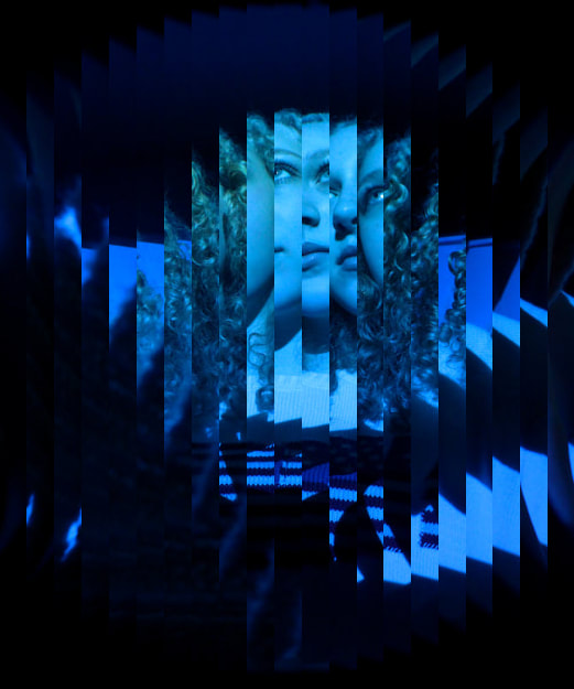
To end this independent project, my final piece is a past photo fragmented further. Using the inspiration of Erwin Blumenfeld I took a picture and put it into photoshop (this contrasts what Blumenfeld does - he fragments it using physical materials while photographing) then I created many equal segments which I could them swap with the corresponding segment on the opposite side of the picture. This then created a fragmented and distorted effect which I could turn into a gif. My final piece consists of these two photos (minus the two gifs) next to each other. One of the images is fragmented horizontally and one vertically, I think this creates a good contrast. My WWW for this piece is that I have learnt a lot about photoshop, gifs and fragments. I also really like how it connects lots of my independent work together in a final piece. My EBI for it is that I would also like to challenge myself to create this physically or using a mirror when I take the photo.
