Looking Up

Using the work of Andy Yeung for inspiration I created a series of images of buildings in my area, Photographing them from a worm’s eye view which created a dramatic effect.
When I was photographing I remembered to pay attention to the following:
WWW: I love the colours especially the sky's and the black and white one stands out as it is different
EBI: I think they could be more symmetrical and more similar to Andy Yeung's work.
When I was photographing I remembered to pay attention to the following:
- The cropping of the picture - make sure to use the edge of buildings to create a dramatic effect
- The ISO - Make sure it is set to a minimum of 400
- Get low and experiment with different angles and crops
- Take your time and take the best images possible
WWW: I love the colours especially the sky's and the black and white one stands out as it is different
EBI: I think they could be more symmetrical and more similar to Andy Yeung's work.
Andy Yeung
|
|
Andy Yeung is a photographer keen on landscape, architecture and aerial photography. Born-and-raised in Hong Kong, he loves capturing great moments and transforming them into something new and artistic is a rewarding experience. His ‘look up’ pieces have won many awards and has inspired my work above. |


Composition
For this assignment we were tasked with developing the composition work we completed in toolkit, we created 4 views of landscape and photographed them around our school. My four composition images which I create were (from left to right), rule of thirds, balance, layers and triangles. Before photographing them we created them physically with, plain white paper, sandpaper and black sandpaper. This gave us more understanding of the layers of the photos.
For my end result:
My WWW: I clearly recreated the images using my surroundings and even used smiler shades in the layers image.
My EBI: The composition of the triangles image was not that similar to the actual image. I was not that happy with my end result of that one, this may have been because there were no layers to it or because there I sonly one triangle not three.
|
|
|


|
|
|


|
End result:
|

Reflected Images
|
How to make a reflected image:
1) Create a blank sheet of paper, File - New - International paper A3 2) Open your image in photoshop then copy and paste your image 3)Select each image and pull them individually into the preferred reflective position, flip one image horizontally |
|


This assignment was to do the above task, create a reflected image however using our looking up images. I actually struggled a lot with this task, possibly because I found it difficult on photoshop but after the first two try's I think the third (this middle image) has worked effectively.
WWW: The images a clearly reflected and are all symmetrical
EBI:I want to create a gif using my reflected images, this is something I didn't have time for and wasn't sure how to do.
WWW: The images a clearly reflected and are all symmetrical
EBI:I want to create a gif using my reflected images, this is something I didn't have time for and wasn't sure how to do.


Framing our Environment
When looking at an environment we are often distracted by the many different parts that make up the scene. And can miss interesting details that are right in front of us. Today's tasks aimed to make me look closer and create more interesting compositions within my work. I went around my school and took a wide shot then used a frame to get a close up of something in the scene.
WWW: I have clearly understood the task and ended up with a couple different pairs of images
EBI: a second response is need to create a further developed pair of images and also I should crop the outside of the frame from the photo
WWW: I have clearly understood the task and ended up with a couple different pairs of images
EBI: a second response is need to create a further developed pair of images and also I should crop the outside of the frame from the photo
|
|

|
John Divola
|
We have based our work of framing the environment on John Divola: Divola was born in 1949 in Los Angeles, CA. He received a B.A. from California State University, Northridge in 1971 and later received an M.F.A. from University of California, Los Angeles in 1974. He has held the position of Professor in the art department at University of California Riverside since 1988. |
|


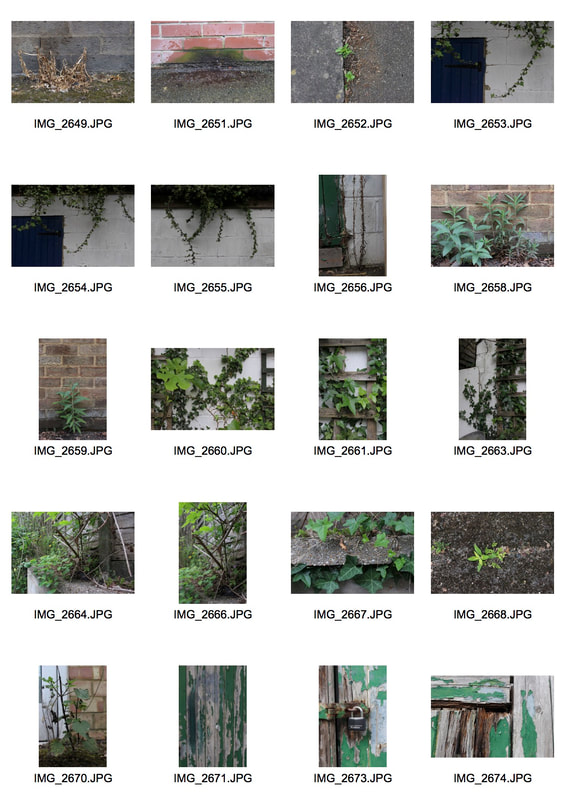
Wild Concrete
This lessons topic is called wild concrete, it's all about plants and wildlife growing through manmade structures or not where they're supposed to be. We based this project off of an artist called Romain Jaquet-Lageze. These photos today were taken behind our school to where there is not much maintenance and plants have overtaken, I used this to my advantage to come up the this outcome.
WWW: I love the way I have present the photos, this is called a contact sheet, it is something I haven't done before but definitely will be using in the future.
EBI: I want to gain more vibrance or mental as well as concrete in my images.
WWW: I love the way I have present the photos, this is called a contact sheet, it is something I haven't done before but definitely will be using in the future.
EBI: I want to gain more vibrance or mental as well as concrete in my images.
|

|


|

|

|
Romain Jaquet-lageze
Romain Jaquet-Lageze is a French photographer based in Hong Kong where he moved in 2009. Since 2010 he has been pointing his camera on my new home to document the different aspects of this city. Four of his photographic series were published as photo books by Asia One Publishing: Vertical Horizon (2012), Wild Concrete (2014), The Blue Moment (2016) and Concrete Stories (2018).
His wild concrete is "Focusing solely on the phenomena of trees sprouting from residential buildings in Hong Kong, it compares the living conditions between plants and humans."
His wild concrete is "Focusing solely on the phenomena of trees sprouting from residential buildings in Hong Kong, it compares the living conditions between plants and humans."


Wild conrete - Responce 2

|

|
This lesson we moved further through our school and created a second response to the wild concrete topic. This time i focused on the vibrance of the plants growing up from the concrete and through the walls.
WWW: I believe I complete my EBI from the first response, I found some mesh ad metal that plats are growing through and made sure to photograph them. EBI: I want to experiment in public areas, like in a busy city, I think this could contrast my 2 recent responses a lot because it would be more urban. |

|


Wild concrete - Home response
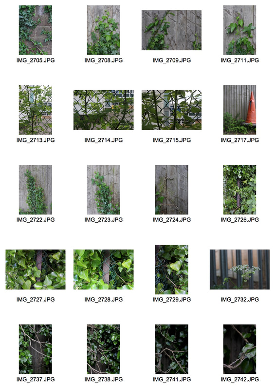
Edward Weston
Edward Weston was a 20th-century American photographer. He has been called "one of the most innovative and influential American photographers" and "one of the masters of 20th century photography." In 1937 Weston was the first photographer to receive a Guggenheim Fellowship, and over the next two years he produced nearly 1,400 negatives using his 8 × 10 view camera. Some of his most famous photographs were taken of the trees and rocks at Point Lobos, California, near where he lived for many years.
Our next project Ordinary to Extraordinary will be based off of his work, I hope to achieve the same clean black and white look that Edward Weston was famous for but also still experiment with the colours on vegetables for example peppers.
Our next project Ordinary to Extraordinary will be based off of his work, I hope to achieve the same clean black and white look that Edward Weston was famous for but also still experiment with the colours on vegetables for example peppers.
|
|
|


Ordinary to extraordinary - response 1
|
|
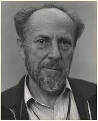
These photos are the first response of my ordinary to extraordinary collection of photos. We learnt about the sun and light this lesson for example if you were to build a photography studio you should build it facing the north for sun slight all day. In our classroom we opened to blinds all the way and set up black backdrops. WWW: This lesson i got some good photos my favourites being the ones of the skull, and in black and white too. They all are in focus and have great lighting. EBI: However this lesson i think i could improve my photos by getting closer up especially photos of the cabbage leaf. |


Ordinary to Extra-ordinary - Response 2
Ordinary to extraordinary - response 3
Response 2 of ordinary to extraordinary meant taking the same photos as the previous lesson with the same props however this time in the dark and using torches to create abstract shadows. This would require different settings for our cameras for example an iso of 2600 and a shutter speed of 1/60.
WWW: Today i think i got some good photos in black and white creating an Edward Weston feel and i also worked on my EBI of last lesson, the close up images (like the cabbage leaf) these have come out well.
EBI: I need to take some whole object photos where you can see the whole object.
WWW: Today i think i got some good photos in black and white creating an Edward Weston feel and i also worked on my EBI of last lesson, the close up images (like the cabbage leaf) these have come out well.
EBI: I need to take some whole object photos where you can see the whole object.
|
|
|


Alberto Seveso
|
Alberto Seveso is a self-taught Italian graphic artist and illustrator, who was first inspired by artwork on skate decks and music album artwork. His unique pieces have been featured on the covers of magazines and CDs around the world, and he’s collaborated with big names such as the temper trap amongst many others. Alberto is probably best known for his portrait work and experiments using ink and high-speed photography. He called himself “someone playing with softwares, hardwares, coulors and creativity” 
|
|


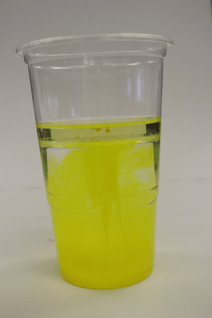
Fireworks in a a Jar
Today we captured the work of Alberto Seveso. We put ink in water with oil, and used a high shutter speed and continuous shooting to take photos. Then edited the brightness and contrast in photoshop. My WWW is that i think i created a good gif and my pictures turned out well however my EBI would be that I want to mix different colours, like prime colours.
|
    |


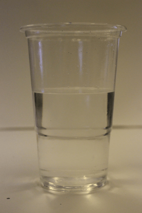
Fireworks in a jar - Response 2
These photos of fireworks in a jar worked more effectively than my response one. My WWW is also that i use more mixtures of colours and also used continues shooting for my gif. My EBI is that i want to get more close ups of the images. As well as this this lesson we did not use oil in the water and i think it worked more effectively.
To edit the photos on photoshop i used the burn tool to create darker contrast on the images. As well as that i used adjustments then the levels histogram to edit the brightness and contrast. I like the burn tool however it creates a very grainy look for my photos and I wouldn't use it all the time.
To edit the photos on photoshop i used the burn tool to create darker contrast on the images. As well as that i used adjustments then the levels histogram to edit the brightness and contrast. I like the burn tool however it creates a very grainy look for my photos and I wouldn't use it all the time.
|
   |


Layered Landscape
Anastasia Savinove
|
Anastasia Savinova is a russian-born artist living in Sweden. A background in architectural studies led her to create these large scale photo collages. Each collage is comprised of multiple layers of photographs shot in various European capital cities. |
   |
Sun Ji
|
Sun Ji, a Shanghai-born artist whose photo collages suggest a nuanced view of the city’s past and present. A curator says the 29-year-old artist’s two-part “Memory City” series is “part cubist collage and part hyperreal landscape.” In one work from his “Memory City I” series, Sun juxtaposes black-and-white photographs of factories, smokestacks, and industrial errata. Glimpsed from across an art gallery, the kitchen-window-sized collage resembles a real photograph. But move closer, and the skewed lines of perspective and improbably dense arrangement of buildings reveal a whimsical critique of China’s late-twentieth-century economic “miracle.”
|
   |

|

|

|

These past lessons we have been recreating Sun Ji and Anastasia Savinove work, making our own layered landscapes. My first three responses were very difficult and looked blocky and the pictures didn't fit in with each other. Overall i didn't like my first two responses at all. However my third response was much better and more developed, i turned it into greyscale. I decided to go with the theme of factories. It took me a long time but i am happier with the outcome.
WWW: I have developed my skills in photoshop a lot in this topic, as well as this i have an end result which you can see the artists we based our work off of inside my work.
EBI: The pictures are either in great quality or terrible quality and each looks very blocky. Next time i would spend more time with the finer details and work the cutting of the images out, because (especially with the image of Big Ben) there is an outline.

Half term work
These images are all taken in London, the buildings are three different types and all show different artictecturhe. My WWW is that i got different angles of some of the buildings and i clearly did what i was asked. However my EBI is that they are not very interesting and the unique and modern building both overlap as they are similar.
Unique building


Old building

Modern building

Development
Reflection
Sebastian Magnani
For my first response i am inspired my the work of Sebastian Magnani and his reflections. These photos are taken with a small mirror on the ground and the camera aims at the ground. Then in the image you can see both the sky or the top of the forest and the ground. The contrast between the two are ofter very interesting, the colours could change or there could be forest and nature in one and not in another.


|
My practice in the lesson:
EBI: These photos are good however they could defiantly be improves, one way is that i found it hard to keep the reflection in the mirror and the ground in focus, this may have been because my aperture was too high. Also the backgrounds and floors are very boring and i need to find better locations for my images. If i continue with he inspiration of Sebastian Magnani's work then i would like to find a mirror without a frame as this may give a better photo and a cleaner outcome. WWW: Later i edited the first two pictures on photoshop, i both the in focus parts onto each other so that then i had an in focus picture. I think this has worked well. However the photo is not very interesting. |

|
Experimenting with photoshop
|
During this lesson of development i decided to experiment with photoshop and reflections, i like the image i have created for my outcome a lot. WWW: The contrast between the modern urban building and the greenery is very dramatic and creates juxtaposition. EBI: One thing that could be improved is around the leaves it is blurry and doesn't look natural at all, this should be improved next time.
|

|


So far in the development project i have just been experimenting, soon i will go and do my first photoshoot which will take place in nature however may not include photoshop. As well as this i would like to use a bigger mirror.
Development 1
This is the first of four development projects that i will be doing before the final piece. Using the inspiration from Sebastian Magnani, I put a mirror on the grass outside then photographed the reflections of the building, creating a contrast between the urban landscape and the nature outside. Then i experimented with making the mirror like a lake. This was when there was very similar reflections on both images on either side of the mirror making it like water reflecting one image. Then i edited my favourite image out of the selection that i had taken to make it more vibrant.
WWW: the image shows the contrast between urban landscapes and nature which i like.
EBI: The image is quite boring.
WWW: the image shows the contrast between urban landscapes and nature which i like.
EBI: The image is quite boring.

|
|
Craig Whitehead
Craig whitehead is a street photographer, otherwise known as Sixstreetunder. I have found his images of reflection of steamed windows on instragram and want to use this style as an inspiration for my next development project. He was born in England, January 14, 1988.
For my next development project i am going to use Craig Whitehead's work as inspiration however may not be able to do it in public spaces. One way i could solve this problem is by steaming up the shower or a mirror in my house and use that as the reflection with somebody standing there.
For my next development project i am going to use Craig Whitehead's work as inspiration however may not be able to do it in public spaces. One way i could solve this problem is by steaming up the shower or a mirror in my house and use that as the reflection with somebody standing there.


Development 2
|
These images are the unedited results of my second response to my four development projects. They have been inspired by Craig Whiteheads reflections on steamed up windows. I like the way the main focus is on the person in the image however the reflection of the background surrounds them.
One thing that went well, the WWW: is that the focus of the image and the aperture work really well together to give a soft finish on the image. The EBI: is that they could be improved in a number ways: 1. the images could be tacken during the night like Craig Whitehead images to give them a more surreal affect. 2. The images could be taken on more steamed up glass than just watered glass. 3. Instead of someone posing a more natural affect may work if the people are just doing day to day tasks. |
|
As well as taking the photos i decided to photoshop images of steamed up windows onto the best image i had taken, this gave a rainy affect and then i had three images to choose from. On photoshop i used the Normal>soft light tool. This overlaid the steamed up window image onto the first image of the subject.


|
To develop Craig Whiteheads Idea even further, i have decide to add real water onto my photo, to explain: i put the photo up on the computer screen then glass in front of it and sprayed the glass with water to create a rainy and steamed up effect which Craig Whithead has in all of his reflection photos.
Overall doing this has really improve the photo. WWW: the different textures and materials used in the photos all bring it together and create a great final piece. EBI: One this i would like to do differently next time is take the photos in the night time, this would create a different mixture of colours and after taking the photo i could again spray the water n it to enhance the steamy affect on the images. |
Final development 2
|
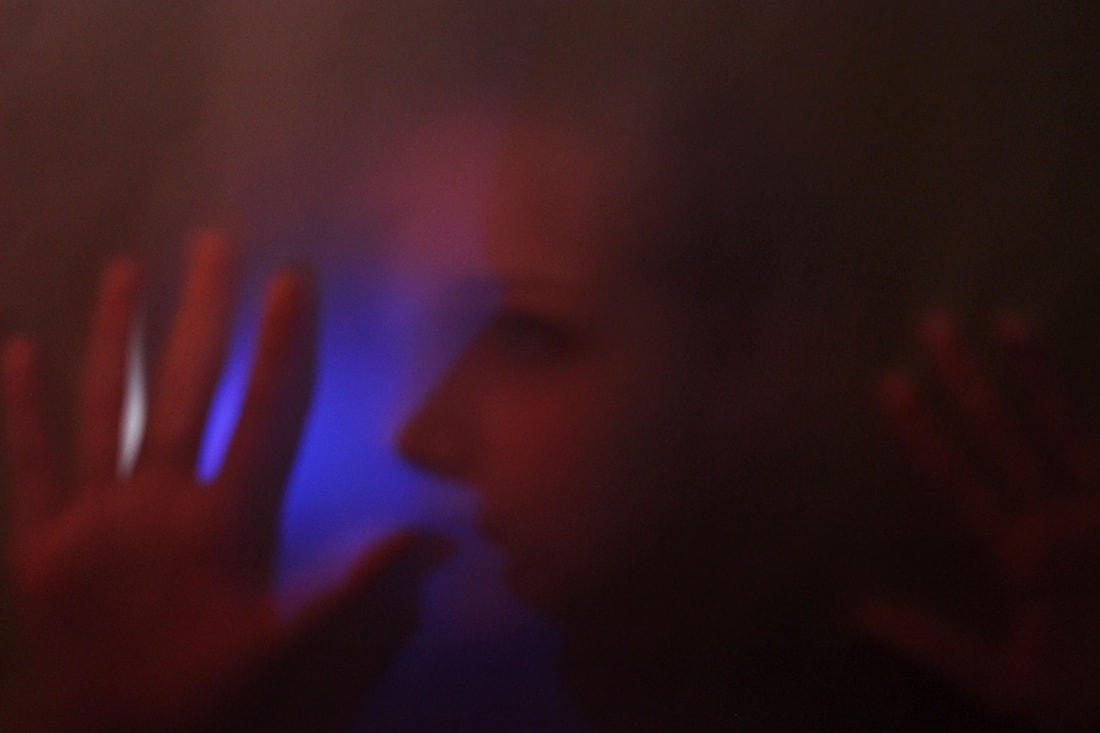
Bill Armstrong
Bill Armstrong photographs very colourful images with tracing paper in front of the lense to give a blurred and confused affect. He is a New York based fine art photographer who has been shooting in color for over thirty years. His work is going to inspire my next development: a colourful, futuristic, blurry collection of images.


Experimenting with tracing paper
|
This lesson i practiced the Bill Armstrong images which i love. I put a massive sheet of tracing paper up, hanging from the ceiling. Then pulled down a massive yellow back sheet and projected coloured light onto my model. This all tied together created Bill Armstrong look onto my images. I love this version of reflections because it takes a slightly different take on the project.
My WWW: is that i love the colours in all the photos and i love the surreal look. My EBI: is that each picture is quite grainy which i'm not sure if i like, as well as this i want to take some slow shutter speed pictures and with the camera with tracing paper not the person. |
|
Development 3
|

|

Development 4
Bill Armstrong Mandela's


|
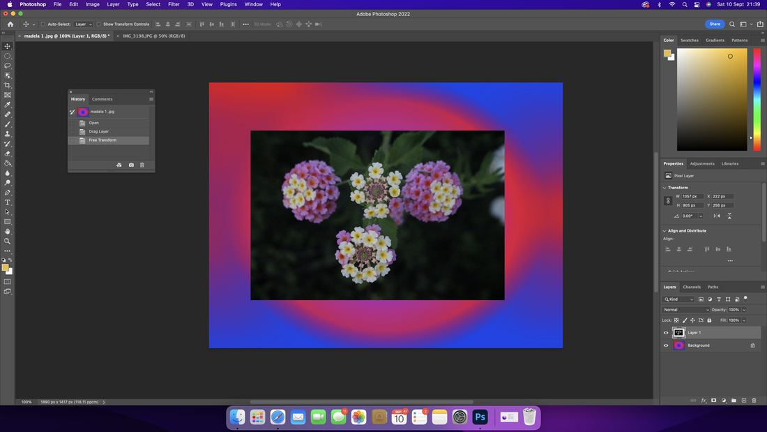
The Mandala photographs are loosely based on Buddhist paintings known as mandalas. Mandalas are concentric circles of images that depict central themes in Buddhism, such as the Wheel of Life or the Map of the Cosmos. Bill Armstrong created this series which i have based this response on. However Armstrong created this project by photographing collages that have been photographed with the camera's focusing ring set on infinity. Extreme defocusing allows to create rhapsodies of color that change as one gazes into them, i used the field blur and colour on photoshop to create my madela's. Using this different technique i created a stronger and more vibrant colour. Putting the flower which i had taken in front added more to the picture as well.
My WWW is that I love the combination of colours and adding the flower(s) created a natural sense to the very modern photos. MY EBI is that Armstrong created the images with a camera and I used photoshop, next time I would like to try using a camera with the focusing ring set on infinity. |
|


Bill Armstrong: Partial Appearances
|
|
To continue using Bill Armstrong as an inspiration for my development i found another one of his series's that he has created, his partial appearances. This involves a silhouette or blurred image of a person with layers of either natural of photoshopped bars of coloured light reflecting over each other. I like these photos because they are similar to the work i have been doing just developed further. |


|
To experiment with the Partial Appearances series I used an image of a person pressed up against tracing paper (which I had already taken) to get the fuzzy out of. focus effect that Bill Armstrong has with his images. Then, in photoshop, I layered who opposite colours to create a similar affect of which appears in Bill Armstrongs images. One thing I would change next time is that you miss part of the image because the colours are so strong so maybe lowering the opacity of them. Also changing the ages of the colour blocks so they look more natural. |

|

|

|
This time, whilst still using the inspiration from Bill Armstrongs, partial appearances series. I have taken a new picture which is more of a fun body image and as well as that on photoshop I doubled up the image and brought the opacity down a blurred the image. After that I put in the colour blocks all in different shades of blues with a black. My WWW: I like the colours and the mismatching colour blocks. My EBI: It is lacking the natural and silhouette look in which Bill Armstrongs images give. |
Development 5


Using an image of a cracked and broken television screen I found on the internet, I photoshopped it on top of the blurring image I had captured before to add colours and light. Another edit I made to this image was I added more of the colour blocks then using the screw tool in photoshop I made them have a more natural feel as if they were light coming through a window, as well as this I lowered the opacity of the colour blocks so that the image felt natural. As well was this I created two matching sellouts photos taken then edited on photoshop, I used motion blur on the actual raw image to create a movement and also I used noise and lowered the opacity on the colour blocks to give them a more neutral and meant to be there feel.
My WWW: The image is very similar to one of Bill Armstrongs images as it is inspired by it and I like how I used a broken television to create this piece.
My EBI: I would like to use a silhouette of a full body image for my final piece as that is what Bill Armstrong uses.
My WWW: The image is very similar to one of Bill Armstrongs images as it is inspired by it and I like how I used a broken television to create this piece.
My EBI: I would like to use a silhouette of a full body image for my final piece as that is what Bill Armstrong uses.


|
This development was first created using tracing paper hung up and a light signing through, then i photographed a person standing with their shilloute showing through. This photos was cropped and edited slightly to make the black and white contrast more. After this, on photoshop, i experimented with the panels and circles that Bill Armstrong uses for his partial experiences. In photoshop i also used many different filters on each panel or part of image, for example noise (creating a grainy panel), Blurs ( like field blur or motion blur to make the panels look more natural and opacity to bring down the boldness of each panel.
|

|
Artist and me:
My development: |
Bill Armstrong's: |
    |

|
Both me and the artist ( Bill Armstrong) have shilloutes with panels and colour reflected onto it, however there are some differences as well, for example:
-i have circles and diagonals of which Armstrong does not include
-i used only a snall range of colors
-my images are less blurry and look less like they have been painted which Armstrongs do
-i have circles and diagonals of which Armstrong does not include
-i used only a snall range of colors
-my images are less blurry and look less like they have been painted which Armstrongs do


My final development before my final peice, is constructed in a group of four, two pairs of silhouettes looking at each other, to show distance between people and the connections between them. The color pallet used is white, grey, black and different dash adds of blue as I found throughout this development project these were the most used colors. The base image of the black silhouette with a white background is in each image copied four times, however each pair is reflected to each other to bring it back to the main idea of refection. The artist that this is inspired by is Bill Armstrong, more closely his partial experiences project. My images have panels, and layers and color to reflect off of Armstrong's work.
My WWW is that i created a very original set of images, loosely based off of Bill Armstrongs work, they have colour even with the main subject being in black and white and they create a ghostly appearance.
My EBI is that the panels and circle were very hard to edit on and i wasn't sure how Armstrong came up with this effect, i struggled with this.
Development 6
Experimenting with light from different angles
Using the inspiration of Bill Armstrong again this lesson i recreated the burley/ grainy pictures. The model, she pressed he face up against a massive sheet of tracing paper handing from the ceiling, this gave the grainy effect. I put a massive photographer light facing from the left to the model making the one side of the model in shadow.
My WWW is that i like how i have recreated the artists work using my own ideas.
MY EBI is that i want to use more colours.
My WWW is that i like how i have recreated the artists work using my own ideas.
MY EBI is that i want to use more colours.


The making of my final piece


Final Piece
|

|
|
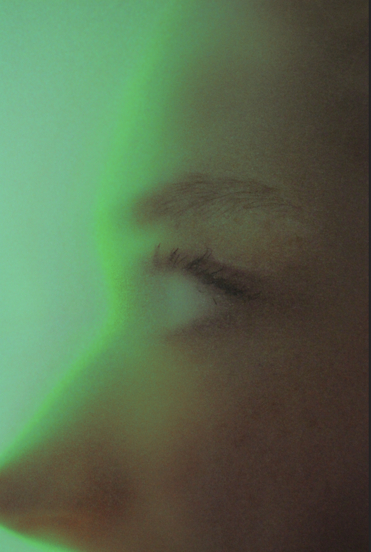
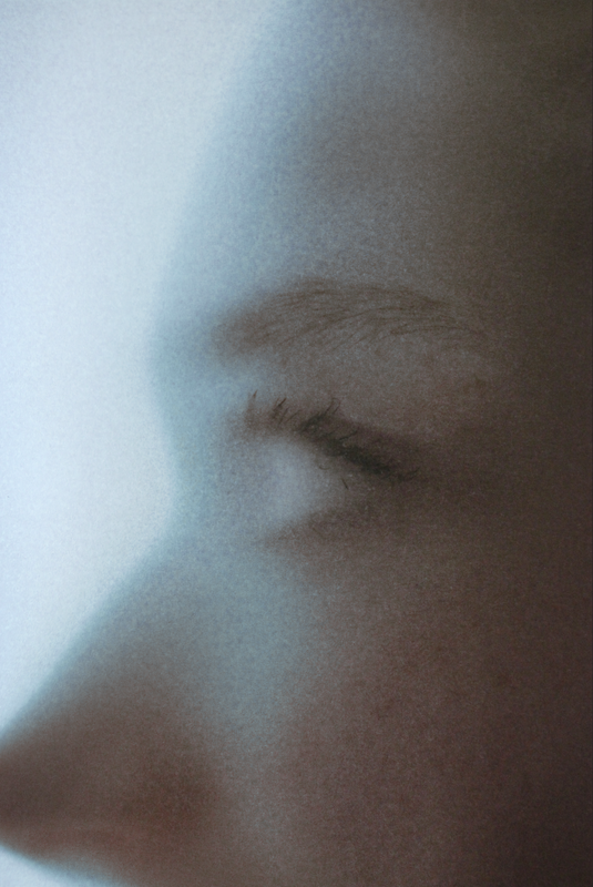
For my final piece, i went back into photoshop and edited my glass up grainy pictures inspired by Bill Armstrong. In photoshop i went to image>adjustments>replace colour and using the eye dropper tool replace the shining bright light with three different very contrasting colours. Now i have a series of three images which all are similar (because of them being the same image) but contrasting colours. Overall i like these images, my WWW is that i like how the focus is on the eye because it it the part of the picture which lack the colour as it is plain white, this happened by her looking straight forward and pressing her face up against the tracing paper. My EBI is that the blue image is not as blue as i wanted it and not as vibrant as i wanted, therefore i should either change that or next time think about the vibrance of the colour.
